Feedback Widget Placement: Best Practices
Feedback Widget Placement: Best Practices
Placing a feedback widget correctly can dramatically improve user engagement and the quality of feedback you collect. Poor placement, on the other hand, can frustrate users, hurt conversions, and lead to irrelevant responses.
Here’s what works:
- Side Tabs: Always visible, low effort, ideal for general feedback.
- Bottom Corner Buttons: Great for multi-purpose feedback but avoid overcrowded areas.
- Inline Widgets: Effective for in-context feedback, such as after help articles or FAQs.
- Action-Triggered Widgets: Activate based on user behavior (e.g., scrolling, exit intent).
Key Tips:
- Keep widgets visible but non-intrusive.
- Avoid interfering with critical actions like checkout or navigation.
- Tailor placement to page type (e.g., passive on homepages, direct on pricing pages).
- Use A/B testing to refine placement and measure success.
Stats That Matter:
- 79% of users will provide feedback if it’s quick and easy.
- Feedback collection can improve retention by up to 15%.
- Aim for completion rates above 80% by keeping forms short and simple.
Widget placement isn’t a guessing game - test, observe, and adjust. When aligned with user intent, feedback widgets become a powerful tool for improving your product and user experience.
Mahmoud Abdelwahab: Building a feedback widget that sparks joy
Where to Place Feedback Widgets on Your Site
The placement of feedback widgets plays a critical role in how users engage with them. Different locations cater to varying user behaviors - passive placements like side tabs are great for casual browsing, while modals or embedded forms are better suited for users actively completing tasks. Here’s a breakdown of the best widget placements and their advantages.
Side Tabs for Always-On Access
Side tabs are anchored to the left or right edge of the screen and stay visible as users scroll. This makes them a low-effort way for users to provide feedback, especially for bug reports or general suggestions, without interfering with their experience.
For desktop, placing the tab on the right edge ensures better visibility. Make sure the tab contrasts with your site’s design and use clear labels like "Report an Issue" or "Feature Request" instead of generic terms like "Feedback."
Side tabs work seamlessly with Modu's Text modules for private bug submissions or with Suggestions modules for ongoing feature requests. Their constant visibility allows users to provide feedback anytime, no matter which page they’re on.
Bottom Corner Buttons
Floating action buttons (FABs) in the bottom-right corner are a familiar and effective feedback tool location. They’re versatile and can serve multiple purposes, such as collecting feedback, sharing product updates, or even capturing leads, without feeling intrusive.
However, the bottom-right corner can get crowded with elements like chat widgets, cookie banners, or sticky footers. If this happens, consider moving the button to the bottom-left corner, especially for mobile users.
To make the button effective, ensure it stands out visually without competing with key actions like checkout or sign-up buttons. It should be noticeable but not distracting.
Embedded Widgets Within Page Content
Inline widgets embedded directly within content are highly effective because they capture feedback in context. For instance, placing them after help articles, product descriptions, or pricing FAQs ensures users can share their thoughts while the content is still fresh in their minds.
Timing is key - embed these widgets only after users have engaged with the content. Asking for feedback too early can lead to incomplete or irrelevant responses.
Modu's Rating modules are ideal for documentation pages, asking questions like, "Was this article helpful?" On pricing pages, Single Choice modules can help uncover objections by posing questions such as, "What’s preventing you from upgrading today?" A subtle design ensures the widget blends naturally into the page without being intrusive.
Action-Triggered Widgets
Action-triggered widgets appear based on user behavior, offering a more tailored approach. For example, they can activate when a user scrolls 50–70% of the page, spends over 45 seconds on a page, shows exit intent, or completes a specific action. This ensures feedback requests are tied to clear engagement signals.
Micro-surveys triggered after key actions - like account creation or a purchase - capture valuable insights while the experience is still fresh. Similarly, exit-intent widgets on desktop can gather feedback before users leave. However, avoid full-screen modals on mobile, as they can frustrate users and may lead to SEO penalties for intrusive interstitials.
The level of interruption should align with the user’s intent. For instance, a more interruptive modal might be appropriate for high-stakes actions like canceling a subscription, while casual browsing calls for less intrusive options, like a side tab or bottom button.
Choosing Placement Based on Page Type
Every page on your site has a specific role, and the way you place widgets should reflect that purpose. Think about it: a visitor casually browsing your homepage isn't in the same mindset as someone about to complete a purchase on a checkout page. Your widget strategy should align with these differing user intents - keep it subtle for casual visitors and more direct for those ready to take action.
As highlighted earlier, tailoring widget placement to the page type is crucial for driving meaningful engagement.
"If you use a high-interruption pattern on low-intent traffic... you get the worst of both worlds: poor data quality and annoyed visitors" [1].
For instance, on your homepage, where users are exploring, a passive side tab or floating action button (FAB) works well. On pricing pages, you can use inline widgets or slide-ins triggered after 45 seconds to gather feedback with targeted questions like, "Which features would prompt you to upgrade today?" [1]. Documentation pages are another story - trigger an inline prompt after the user scrolls through 70% of the content to collect feedback right when it's most relevant [1].
Error pages need special attention. A 404 page already frustrates users, so it's important to provide a quick way for them to report the issue. Placing a Text module inline near the error message allows users to flag the broken link instantly. This not only helps your team fix issues but also shows visitors you’re proactive about improving their experience [4][5].
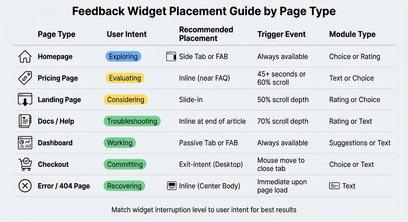
Here’s a quick breakdown of the best placements for different page types:
Page-Specific Placement Guide
| Page Type | User Intent | Recommended Placement | Trigger Event | Module Type |
|---|---|---|---|---|
| Homepage | Exploring | Side Tab or FAB | Always available | Choice or Rating |
| Pricing Page | Evaluating | Inline (near FAQ) | 45+ seconds or 60% scroll | Text or Choice |
| Landing Page | Considering | Slide-in | 50% scroll depth | Rating or Choice |
| Docs / Help | Troubleshooting | Inline at end of article | 70% scroll depth | Rating or Text |
| Dashboard | Working | Passive Tab or FAB | Always available | Suggestions or Text |
| Checkout | Committing | Exit-intent (Desktop) | Mouse move to close tab | Choice or Text |
| Error / 404 Page | Recovering | Inline (Center Body) | Immediate upon page load | Text |
Mobile Widget Placement
Designing for mobile screens requires a different approach than desktops. With limited space and thumb-based navigation, placing a feedback widget needs careful thought to avoid interfering with critical elements like keyboards or UI components.
Bottom corners are the go-to spots for these widgets. Typically, the bottom-right corner works best. However, if that space is occupied by a chat widget or a cookie banner, the bottom-left is a solid alternative [1]. Opt for compact designs like a Floating Action Button (FAB) or a pill button instead of full-screen modals. These options stay visible without overwhelming the screen [1][3]. Small edge-anchored tabs are another good choice, especially for passive feedback collection [1].
To keep users engaged, simplify feedback forms. Stick to just two fields - this setup not only works well with on-screen keyboards (which can take up nearly half the screen) but also boosts completion rates to around 80% or higher [3]. For readability, ensure text is at least 14px in size, as smaller fonts can be hard to read on mobile devices [3].
Timing and context are crucial. Avoid enabling feedback widgets during critical workflows like checkout, onboarding, or while using editors. Interrupting these processes can block essential buttons or disrupt conversions [1]. Plus, Google penalizes intrusive interstitials on mobile, so keeping widgets subtle is key for both user experience and SEO [1].
For optimal engagement, trigger popup widgets strategically. For example, activate them after a "win moment", such as when a user completes a task. Inline widgets, on the other hand, work best at the end of content sections and can be triggered after users scroll through 70% of the page. This timing captures feedback at the most relevant moments [1].
Testing and Improving Widget Placement
Finding the perfect spot for your widget takes more than a single guess. Using A/B testing can help you figure out what works best - whether it’s a side tab or a bottom corner, or even the timing of the trigger (like 30 seconds in versus after 60% of the page is scrolled) [1]. The key is to change just one variable at a time so you can pinpoint exactly what’s driving the results.
When you’re testing, don’t stop at raw engagement numbers. Include a holdout group to measure the incremental lift your widget placement provides [1]. Track both outcome metrics (like signup rates, demo requests, or activation completions) and feedback quality metrics (such as completion rates, useful response rates, and how stable the top themes are) to ensure you’re not sacrificing quality for quantity [1]. Shoot for a submission rate between 0.5% and 2% and a completion rate of at least 80% [3].
Keep an eye on guardrail metrics like bounce rates, page speed, rage clicks, and dismissal rates. These will alert you if the widget is negatively affecting the user experience [1]. Make sure to run your tests long enough to account for both weekday and weekend traffic, as user behavior in SaaS often shifts depending on the day [1].
Even something as small as the button text can make a big difference. Test specific phrases like “Report an issue” or “Share feedback” against more generic ones - specific wording often leads to better results [1].
| Metric | Target | Why It Matters |
|---|---|---|
| Submission rate | 0.5–2% of users | Ensures the widget is easy to find [3] |
| Completion rate | 80%+ | Confirms the form isn’t too complicated [3] |
| Actionable rate | 60%+ | Measures the quality of responses [3] |
| Response time | < 24 hours | Builds trust with users [3] |
Use these metrics to fine-tune your widget placement across different pages and improve the overall experience for your users.
Conclusion
Placing widgets effectively means aligning their position with what users are trying to do. For low-intent pages, like your homepage, passive options such as floating buttons or side tabs work best. On the other hand, pages where users show high intent - like when they’re exploring pricing details or finishing onboarding - can handle more direct prompts without negatively impacting conversions [1].
The numbers back this up. 79% of consumers are willing to provide feedback if the process feels quick and straightforward. Companies that actively gather feedback often see retention rates improve by up to 15% [2]. To hit these results, make the process as smooth as possible. Keep forms short - two fields max - and let your system automatically capture technical details like the browser type or current URL. This can help you achieve completion rates over 80% [3].
Think of widget placement as a spectrum. For general feedback on low-intent interactions, use passive tools like side tabs. For context-specific insights, place inline widgets at the end of help articles or near pricing FAQs. Post-action popups work well after users achieve a milestone, like completing their first integration. Finally, use exit-intent triggers on critical pages like checkout to understand why users might leave without converting [1].
The key is to continuously test, observe, and tweak based on user behavior. When you align widgets with user intent, feedback collection stops being a guessing game and becomes a dependable strategy for making smarter product decisions.
FAQs
How do I pick the best widget placement for each page?
To determine the best spot for a widget, think about the user's journey and how much disruption fits their intent. Pay attention to engagement signals like scroll depth or time spent on the page. Match the widget's placement to the level of interaction:
- High-interruption: Use this for critical actions or exit-intent scenarios where grabbing attention is key.
- Medium-interruption: Ideal for contextual prompts that align naturally with user behavior.
- Low-interruption: Best for passive options like floating tabs that users can engage with at their own pace.
Steer clear of placing high-interruption widgets on pages where users have low intent. This can lead to frustration and lower-quality feedback.
What triggers should I use for popups without annoying users?
To keep users engaged without irritating them, rely on engagement-based triggers like scroll depth, time spent on the page, returning visits, or clicks on specific elements. These actions show a user’s intent and their readiness to interact or share feedback.
On the flip side, avoid using intrusive triggers, such as popups that appear immediately when the page loads or on pages where users are unlikely to engage. These can feel disruptive and lead to frustration.
By timing feedback requests thoughtfully, you can make them more relevant, reduce annoyance, and ultimately improve the quality of responses you receive.
What metrics show my widget placement is effective?
Metrics that show how well a widget is placed include engagement signals such as click-through rates, completion rates, and user interactions. On top of that, the amount and quality of feedback gathered can reveal insights about the widget's visibility and ease of use.